When your visitors sign up to your newsletter, don’t just show them a pop up message saying “Thanks for subscribing.” Send them a great looking Welcome email with a bit more character! We’ve put together 5 awesome examples of Welcome emails.
A welcome email is a great opportunity to get a bit of your branding into your prospects’ inboxes, and to show them a little bit more about who you are.
Here are our 5 most awesome Welcome email examples you should have a look at. We felt it necessary to show the entire email, so be warned, there’s some scrolling here!
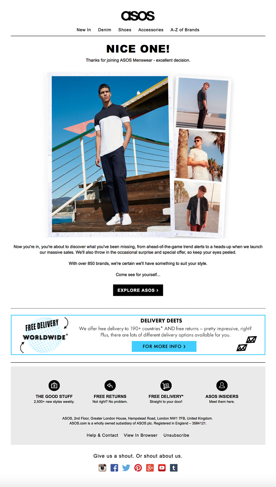
5. Asos welcome email

Asos ask for your gender at the point of sign up so you can get relevant newsletters to your inbox. They even make it relevant in this welcome email. That’s the kind of attention to detail you need. It’s clean and simple with some strong images to start with, then some USPs further down in their own dedicated section.
4. Zapier welcome email

Zapier’s welcome email is super slick – The sections stand out well, but what we liked the most was putting the latest blogs in there. It’s a great opportunity to display several blogs, which explains what your company is talking about or interested in.
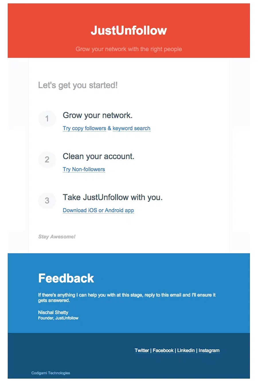
3. JustUnFollow welcome email

If this doesn’t give clear direction, we don’t know what does. Three simple bullet points explain the steps you need to take with this company. They even give some links to help you on your way. The colour are bold and bright and make each section pop even more.
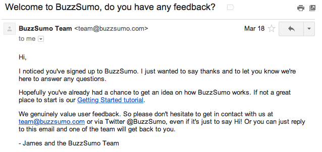
2. Buzz Sumo welcome email

Thanks to getvero.com for this one – We wanted to show a B2B welcome email that works really well by using a personal approach. B2B marketing is about a personal approach to every contact you have. This isn’t mass marketing like B2C is, you need to get a 1:1 conversation going. This email looks like it’s come from “James” manually rather than automatically. We still think it could be tweaked a bit more to be more personal and slightly less sales-ey, but it’s pretty much there.
1. Reiss welcome email

This email just begs you to keep scrolling. It starts to feel like you’re back on the website – That’s engaging for your customers! Like Asos, they ask you to choose your gender, but they don’t over complicate it with Names, Titles, Addresses or Shoe Size requests. Once you’ve signed up and the email comes through, they give you the chance to click a link to personalise your emails a bit more (you’ll see the link just below the hero image).
We were disappointed when we signed up for the John Lewis newsletter. We get their emails quite regularly, but they don’t actually send out a Welcome email. Shame on you, John Lewis!
Credit to hopeforyourfamily.com for the welcome mat image.
We can help setup your welcome emails, from designing, to building, to pushing live. Get in touch if you want a helping hand