As devices and platforms continue to change, the types of emails are understandably changing with it. The truth is that the names of the various email types are also changing.
(Date of last update – 19 March 2017)
For example, a ‘responsive’ design used to do very different things to what they do now.
Litmus, a global icon in the email-coding world, explains in one of their blogs back in 2012 that the best email format is a combination of responsive and scalable (without giving that combination a name). In another blog in 2014 they contradict themselves and say responsive combines fluid with scalable emails.
Confused? You’re not alone. These terms are not documented anywhere and are essentially suggested by the influential names in the industry. There are even more names around such as ‘skinny’, ‘optimised’ and ‘adaptive’ that only confuses the situation even more.
We’re going to break down what we see as the four main types and what they’re all about.
Let’s start with the most basic form; Fixed. This is where emails began and in crude terms, are dated.
Fixed Email Layouts

- Single layout on all screen sizes
- All elements are static; they stay in the same position on any device
- Quick and easy to code
- Doesn’t look good on mobile devices
- Some content on smaller devices will be cut off, requiring people to zoom and move the window
- Clicking CTAs is fiddly due to the need to zoom in/out
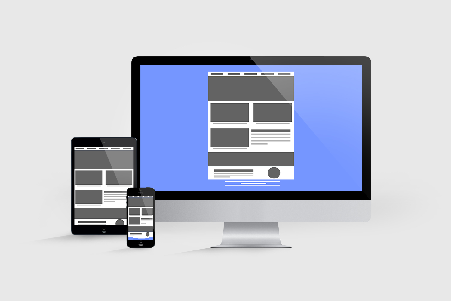
It uses a single layout that stays the same size on all devices – All elements stay in the same position in relation to the other elements, and all the sizes of those elements is static.
Whilst it is the fastest and easiest type of email to build, it has major limitations when users are viewing the email on anything other than a desktop computer. Viewing the email on a mobile device initially shows the content being cut off, as can be seen in the mobile device in the image above. To be able to view all the content, mobile users have to move the screen around, zoom in and out. It makes them fiddly to click exactly what you want (for example a call to action or link within some text) and can be frustrating to navigate.
In a modern era people expect content to adapt to them, not them needing to adapt to you. This lack of usability reduces click through rates and in turn, conversions. In short, using a fixed template can lose revenue.
62% of people use a mobile device. Alarmingly, 71% of companies are still using fixed email templates* without any form of mobile optimisation. That means almost 3/4 of all companies are not optimising the experience for 62% of their customers.
*Source: http://www.adestra.com/resources/infographics/email-marketing-report-card/
We move on in time to responsive emails. As mentioned before, this used to mean something different to what it does now.
Responsive Email Layouts

- When they were first “invented” they had a single desktop version and a single mobile version
- The two versions were often coded one on top of the other, with the mobile version simply being hidden on desktop devices, and vice versa
- The mobile version uses a single break point
- Worked well when there were fewer devices around
- “Responsive” is now a term used for a layout that uses sometimes several media queries and
%values rather than fixedpxvalues
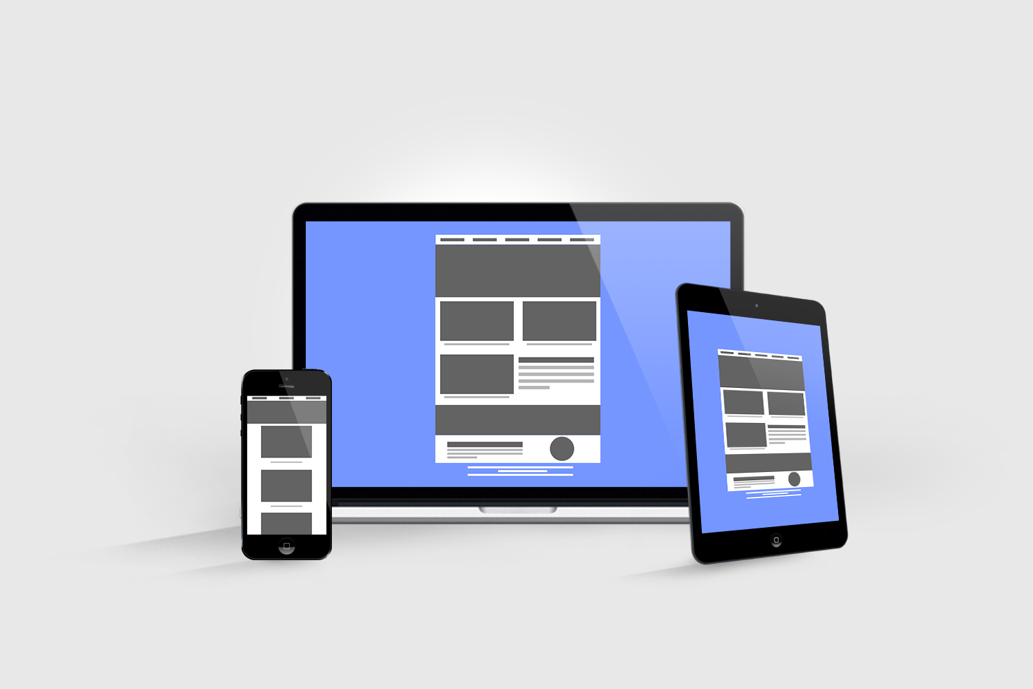
Originally it consisted of two versions – A single desktop version and a single mobile version. Each version uses a ‘break point’ – A screen width the template is set to change layout to. The template would detect the width of the user’s screen and output one of the two designs based on that width.
A few years ago when there were fewer devices and fewer mobile screen widths this solution worked very well. The desktop version covered all laptops and PCs and the mobile version covered the much smaller range of iPhones. The limitation now is that there are so many more mobile devices supporting email, each having their own unique device width. iPhone alone currently has four screen widths, and that doesn’t allow for their iPods and iPads. Add in Samsung, Nokia and all the other big players and break points become far too complicated to cater for.
As the size of the mobile screen increases, more blank space is created around the edges of the screen. This also makes the size of the text and elements smaller on the larger of the mobile screens.
The coding on these types of designs was also often quite primitive, with elements being created to specifically show on mobile whilst being hidden on desktops. The result for most the part is ok-looking, but still not ideal. It meant you were coding two separate emails, which had an impact on email file size and likely on spam filters, too.
We move on to an easier to follow concept – Scalable.
Scalable Email Layouts

- Usually a single-column layout
- Uses a single design that will look good on desktop and mobile devices, without the actual content changing in size
- Large images and font sizes to make the content readable on mobile without zooming
- Does not use media queries
- Easy to code
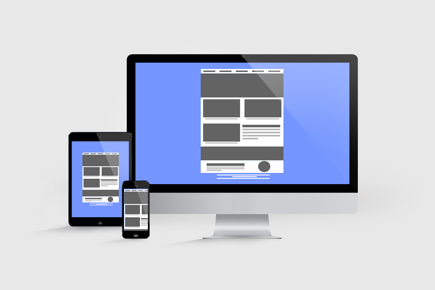
This keeps the same grid layout on all devices but adjusts proportions to suit the screen width. Larger fonts can be used to make sure they can still be read on mobile devices, with calls to action also being a large size. The code is created using % instead of px, or max-width. Every element is therefore reduced or increased proportionally to the screen size.
This concept is slightly easier to code than the original responsive templates however can lack clarity on the elements due to them being reduced in size all over. This format is also not a true responsive email and can suffer the same usability issues as a fixed template.
Lastly, we come to Fluid emails.
Fluid Email Layouts
These are the best all-rounders and look perfect on any device, regardless of the screen width.

- A combination of all email technology
- Uses several media queries and % values
- Content adapts to any screen size by using a % of the width
- Most advanced but also most complicated to code
It uses a combination of the traditional responsive logic along with scalable logic.
Not only is the grid layout adapting and moving around depending on the width of the screen, but it also keeps to a percentage of the screen.
It starts by using a break point to change the layout. Any screen size below that break point uses the percentage to ensure the adapted layout fills 100% of the screen.
It is the most advanced and complicated version to code but looks much cleaner and more modern than all other versions.
Which email layout should you use?
Simply, Fluid email layouts are the ones to use. They adapt to all screen sizes and you can even show specific content to an exact screen size, making it ideal for all viewers.